Brand Identity & Logo Design · Healthcare & wellness

Timeless Healing Brand Identity

Logo and brand identity for Timeless Healing, a wellness brand: an abstract wave mark, Sallyora and Outfit typography, a crimson and soft neutral palette, and guidelines that carry from social media to merchandise.

Commissioned client work · Designed by Gul E Lala Khan for Timeless Healing, a wellness brand in the UK

See what brand identity and logo design includes
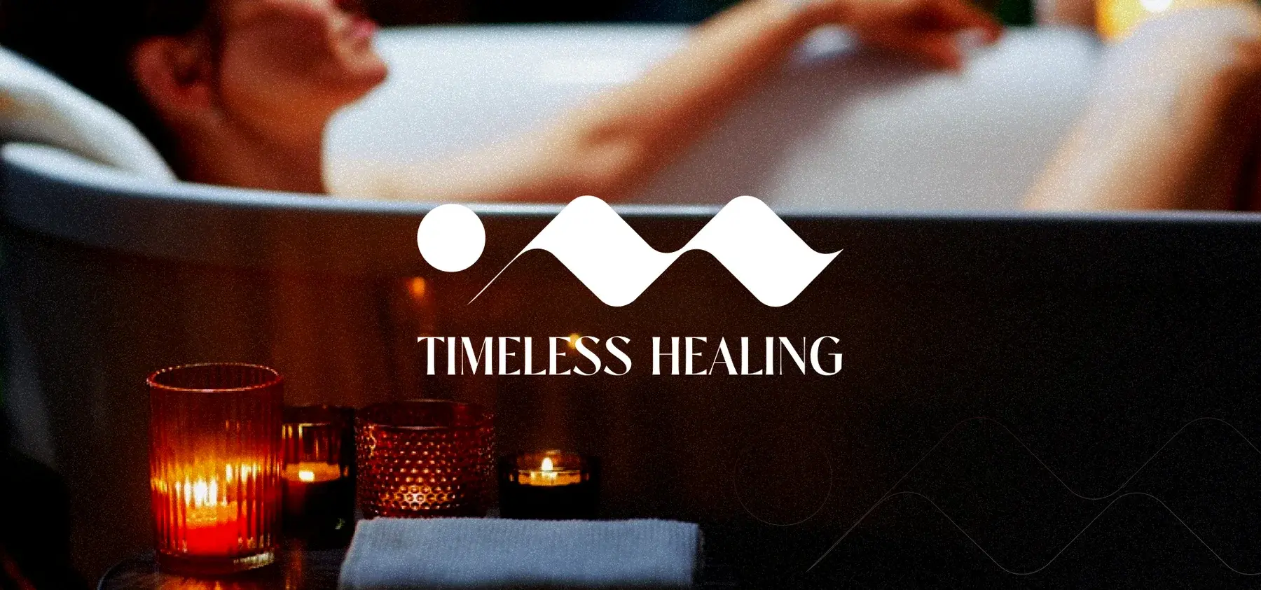
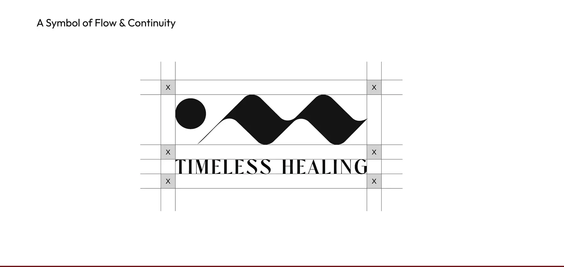
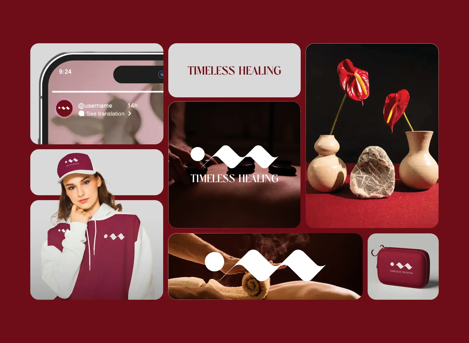
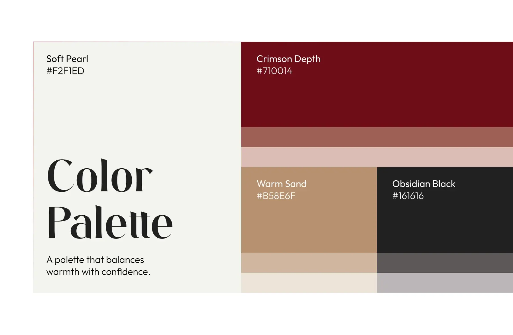
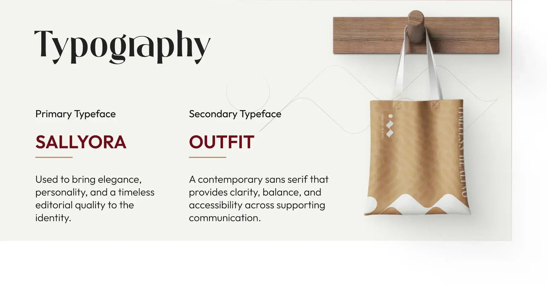
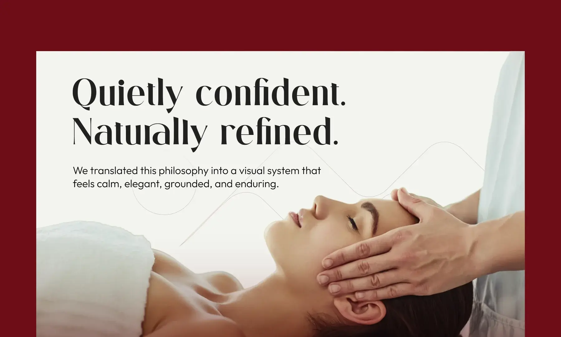
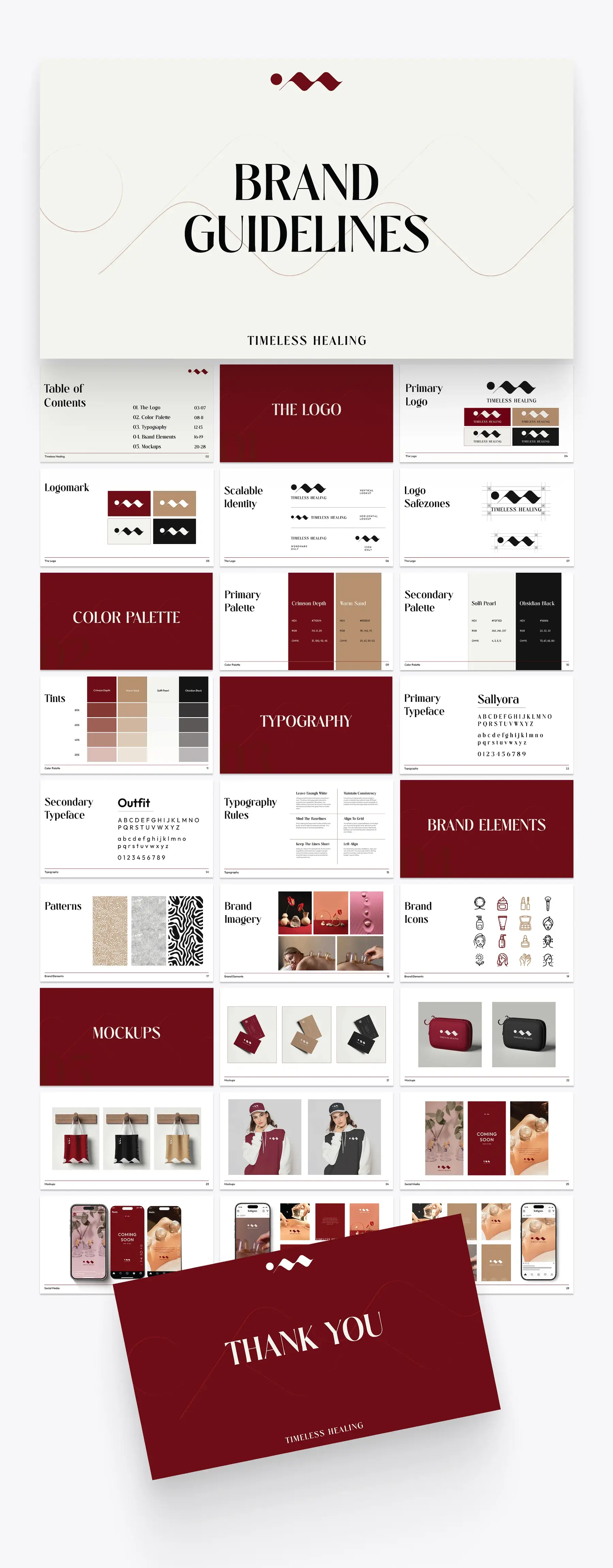
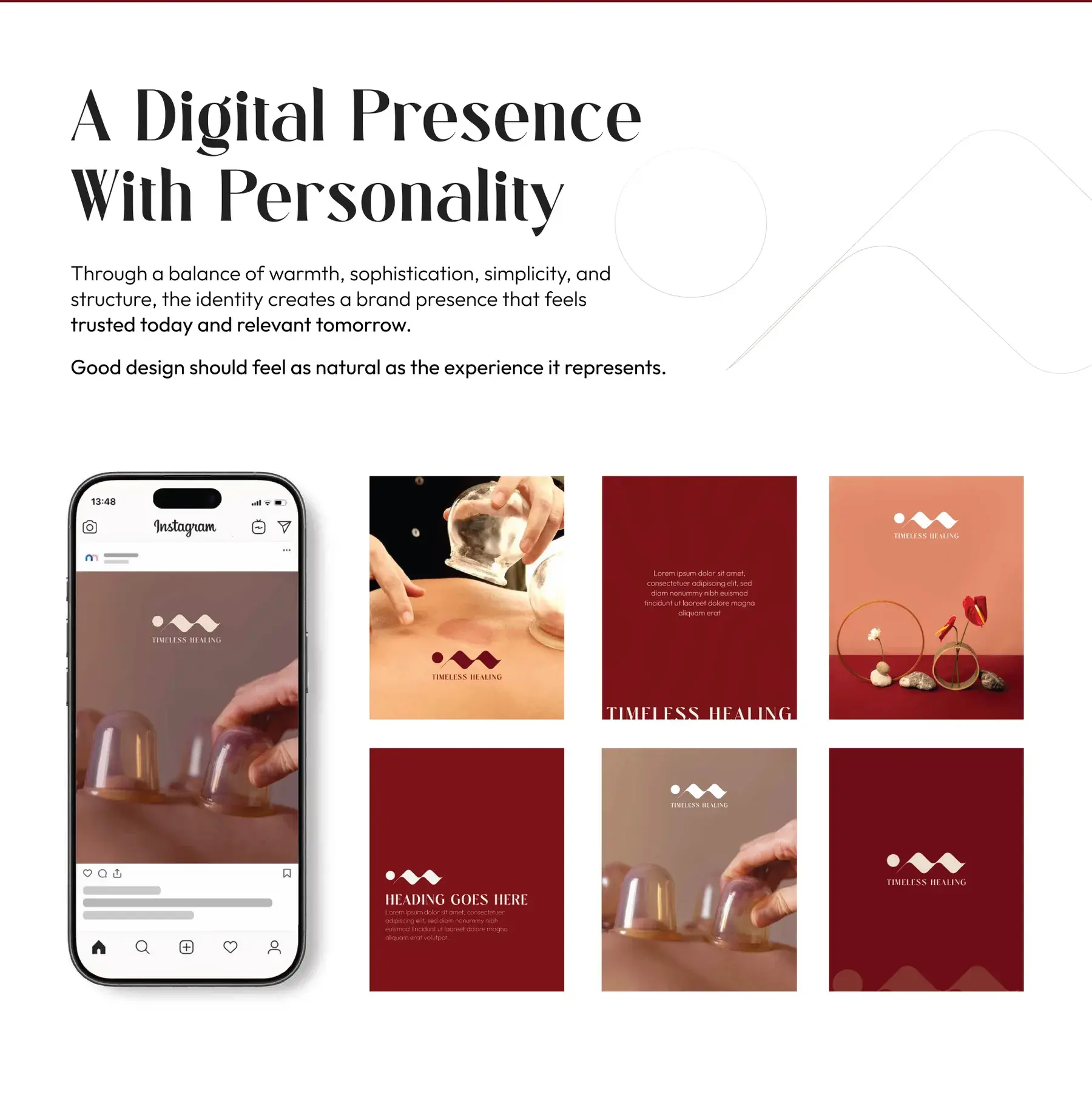
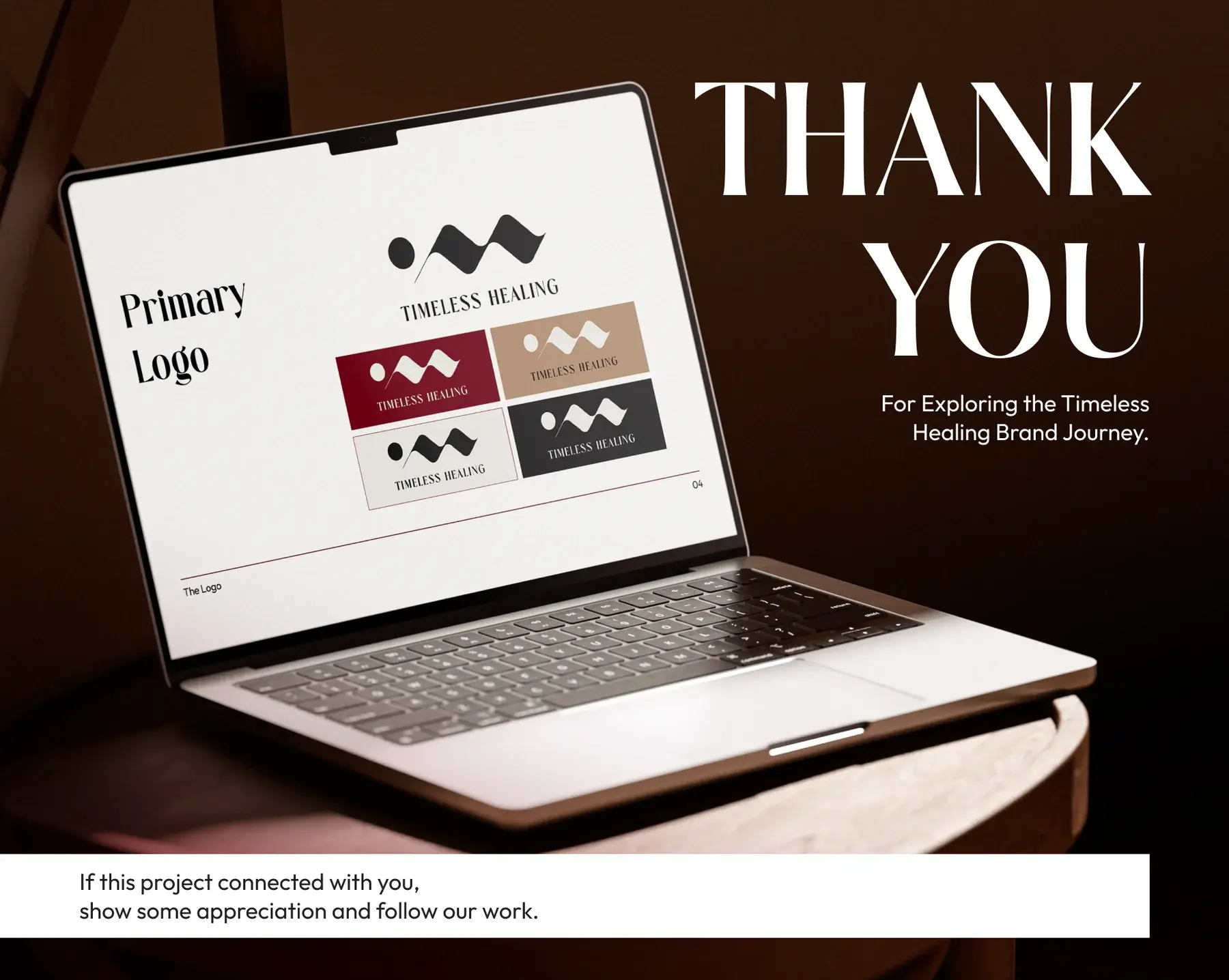
Case study title slide: the Timeless Healing wave mark over a woman relaxing in a candlelit bathLogo and brand identity overview: a visual identity that communicates wellness in a way that feels calm, elevated, approachable and contemporaryA mark designed to endure: client Timeless Healing, industry wellness and healing, beside the crimson wave markA symbol of flow and continuity: the Timeless Healing logo on its construction grid with x-height clear spaceBrand applications on crimson: phone screen, business cards, a hoodie, candles, a massage scene and a zip pouch with the wave markColor palette: Soft Pearl, Crimson Depth, Warm Sand and Obsidian Black with their tints, a palette that balances warmth with confidenceTypography: Sallyora as the primary typeface and Outfit as the secondary, beside a patterned tote bag on a wooden hookQuietly confident, naturally refined: a visual system that feels calm, elegant, grounded and enduring, over a facial massage photographYour time, your space, your wellbeing: the final identity transforms Timeless Healing into a brand with a clear and ownable visual presenceFull brand guidelines overview: cover, table of contents, the logo, color palette, typography, brand elements, mockups and a thank you pageA digital presence with personality: an Instagram profile on a phone beside nine social tiles in crimson, sand and pearlGood design gets noticed, great brands get remembered: brand strategy, identity, packaging and creative directionThank you slide: a laptop showing the primary logo page of the guidelines, for exploring the Timeless Healing brand journey

about this project

Timeless Healing needed a visual identity that could communicate wellness in a way that felt calm, elevated, approachable, and contemporary.

Rather than relying on predictable clinical aesthetics, the identity was developed around warmth and emotion. A distinctive abstract mark, elegant typography, rich crimson tones, and soft neutrals come together to create a brand that feels considered and memorable.

The palette balances warmth with confidence: Soft Pearl, Crimson Depth, Warm Sand, and Obsidian Black. Sallyora, the primary typeface, brings elegance, personality, and a timeless editorial quality to the identity; Outfit, a contemporary sans serif, provides clarity, balance, and accessibility across supporting communication.

The final system was designed to remain consistent across both intimate wellness experiences and everyday brand touchpoints, from digital communication and social media to merchandise and printed materials. Through a balance of warmth, sophistication, simplicity, and structure, the identity creates a brand presence that feels trusted today and relevant tomorrow.