Brand Identity & Logo Design · Ecommerce & DTC
Sienna Terra Brand Identity


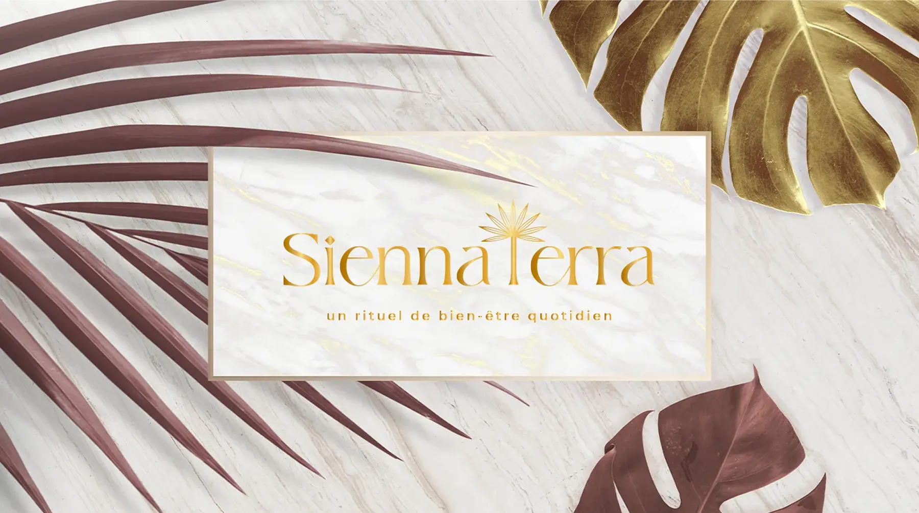
Brand identity for Sienna Terra's handcrafted dry-brushing tools: a golden-hour palette, a palm mark, graded photography, named product bundles, and gold-foil packaging that reads as a daily ritual rather than a bathroom accessory.
Commissioned client work · Designed by Gul E Lala Khan for Sienna Terra, a dry-brushing and body care brand in France
See what brand identity and logo design includes


about this project
Sienna Terra makes handcrafted dry-brushing tools, body brushes, scalp brushes, and face brushes designed to turn a simple morning habit into a quiet daily ritual. The brand needed an identity that felt as considered as the product itself: warm, tactile, and rooted in nature, without tipping into the cold, clinical language of most skincare branding.
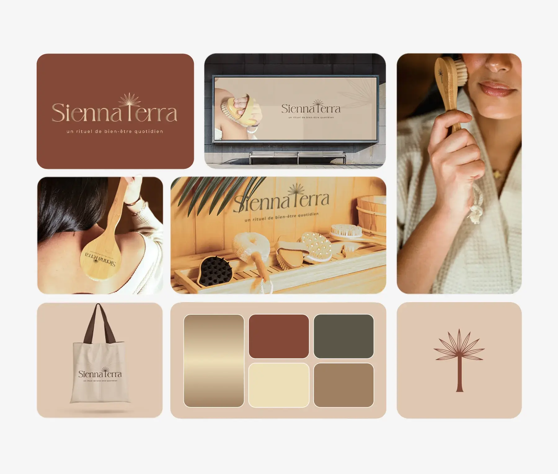
The goal wasn't just a logo. It was a full visual world, one cohesive enough to move seamlessly from a gold-foil packaging mockup to a product photo to a checkout page, and still feel like the same brand every time.
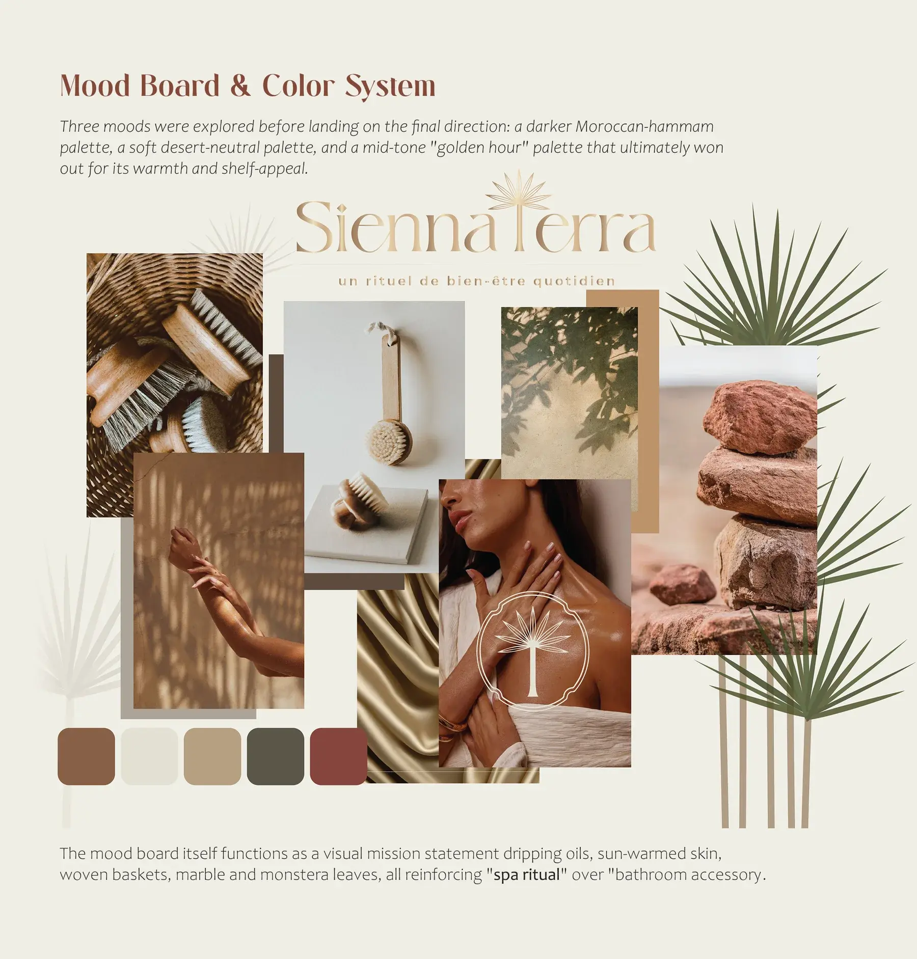
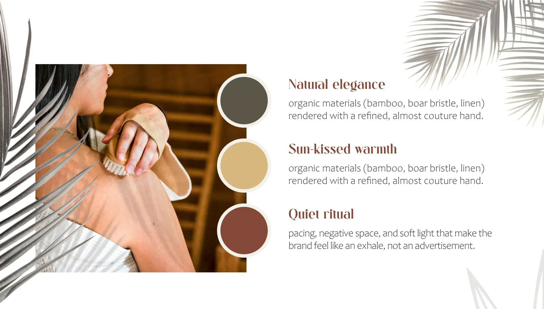
Three moods were explored before landing on the final direction: a darker Moroccan-hammam palette, a soft desert-neutral palette, and a mid-tone golden hour palette that ultimately won out for its warmth and shelf appeal. The mood board itself functions as a visual mission statement: dripping oils, sun-warmed skin, woven baskets, marble and monstera leaves, all reinforcing spa ritual over bathroom accessory.
Raw product photography was shot in natural, golden-hour-adjacent light, but the grade is where the brand truly comes together. Every image was pushed toward the same warm midtone family used in the brand palette, so that a photo of a hand holding a brush feels visually identical to the logo lockup beside it.
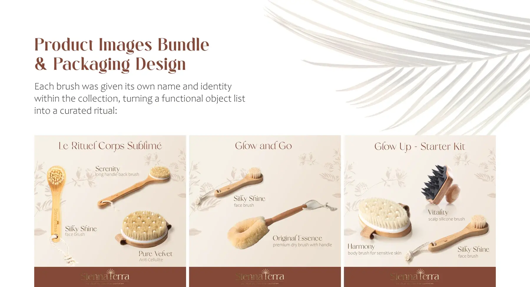
Each brush was given its own name and identity within the collection, turning a functional object list into a curated ritual: Le Rituel Corps Sublimé, Glow and Go, and the Glow Up starter kit.
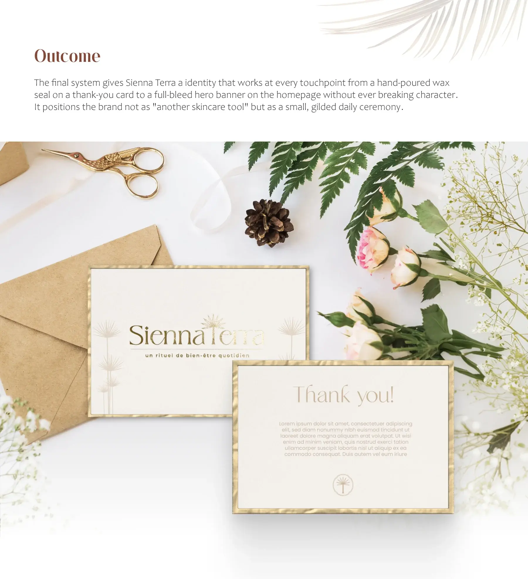
The final system gives Sienna Terra an identity that works at every touchpoint, from a hand-poured wax seal on a thank-you card to a full-bleed hero banner on the homepage, without ever breaking character. It positions the brand not as another skincare tool but as a small, gilded daily ceremony.