Brand Identity & Logo Design · Beauty & personal care
LumiLauren Skincare Brand Identity & Packaging


Skincare brand identity and packaging for LumiLauren: a feminine botanical mark, a soft teal palette, Bingar and BDO Grotesk typography, and a product system spanning serum, cleanser, and LED mask packaging.
Commissioned client work · Designed by Gul E Lala Khan for LumiLauren Skincare, a skincare brand in Zambrów, Poland
See what brand identity and logo design includes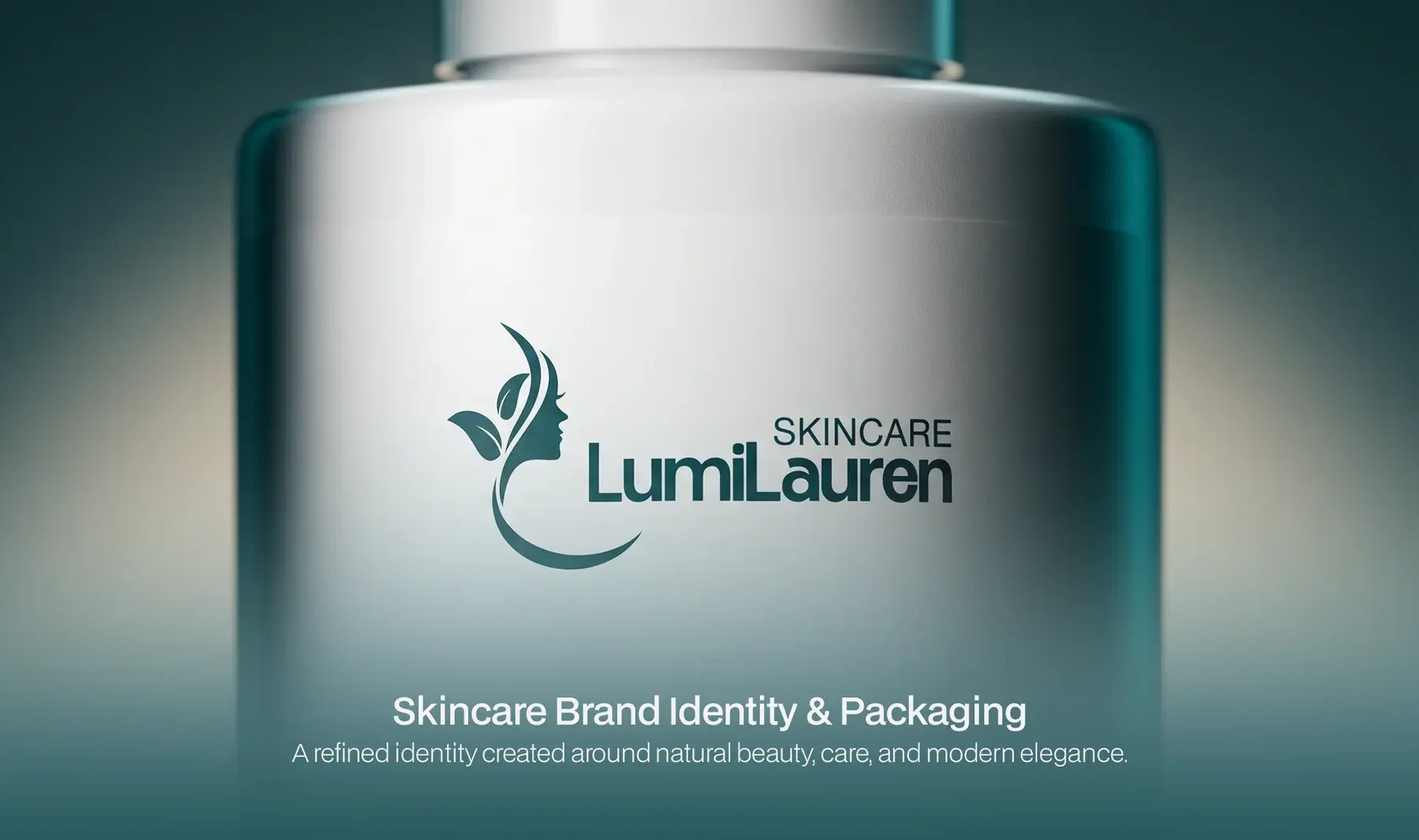
about this project
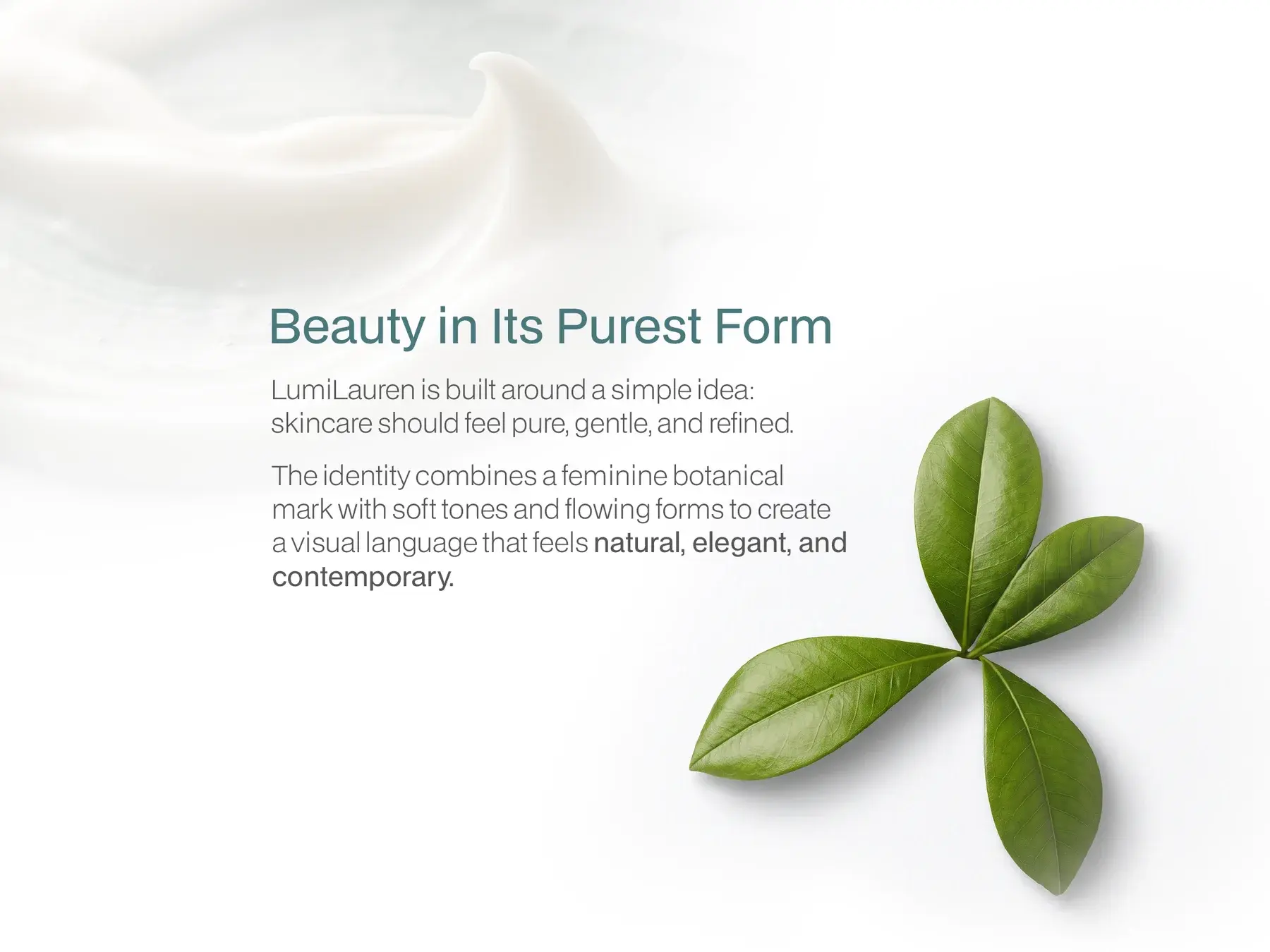
LumiLauren is built around a simple idea: skincare should feel pure, gentle, and refined. The identity combines a feminine botanical mark with soft tones and flowing forms to create a visual language that feels natural, elegant, and contemporary.
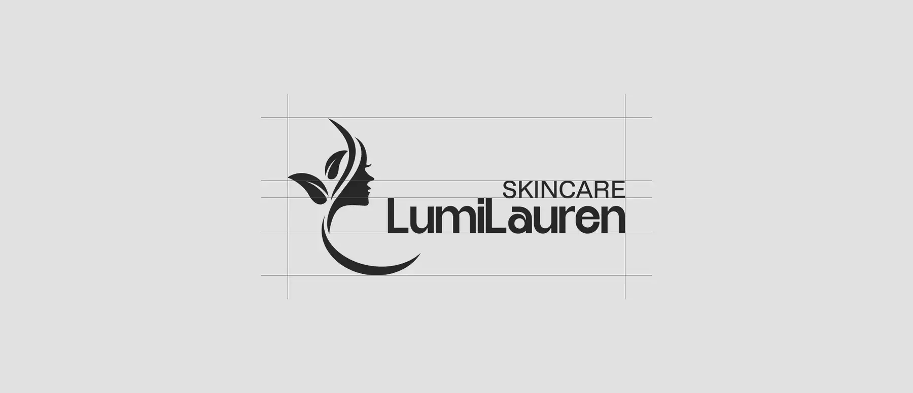
The LumiLauren mark brings together a feminine profile and botanical forms, creating a symbol that connects beauty with nature: the feminine form for beauty and elegance, the botanical element for nature and purity, and flowing lines for movement and care.
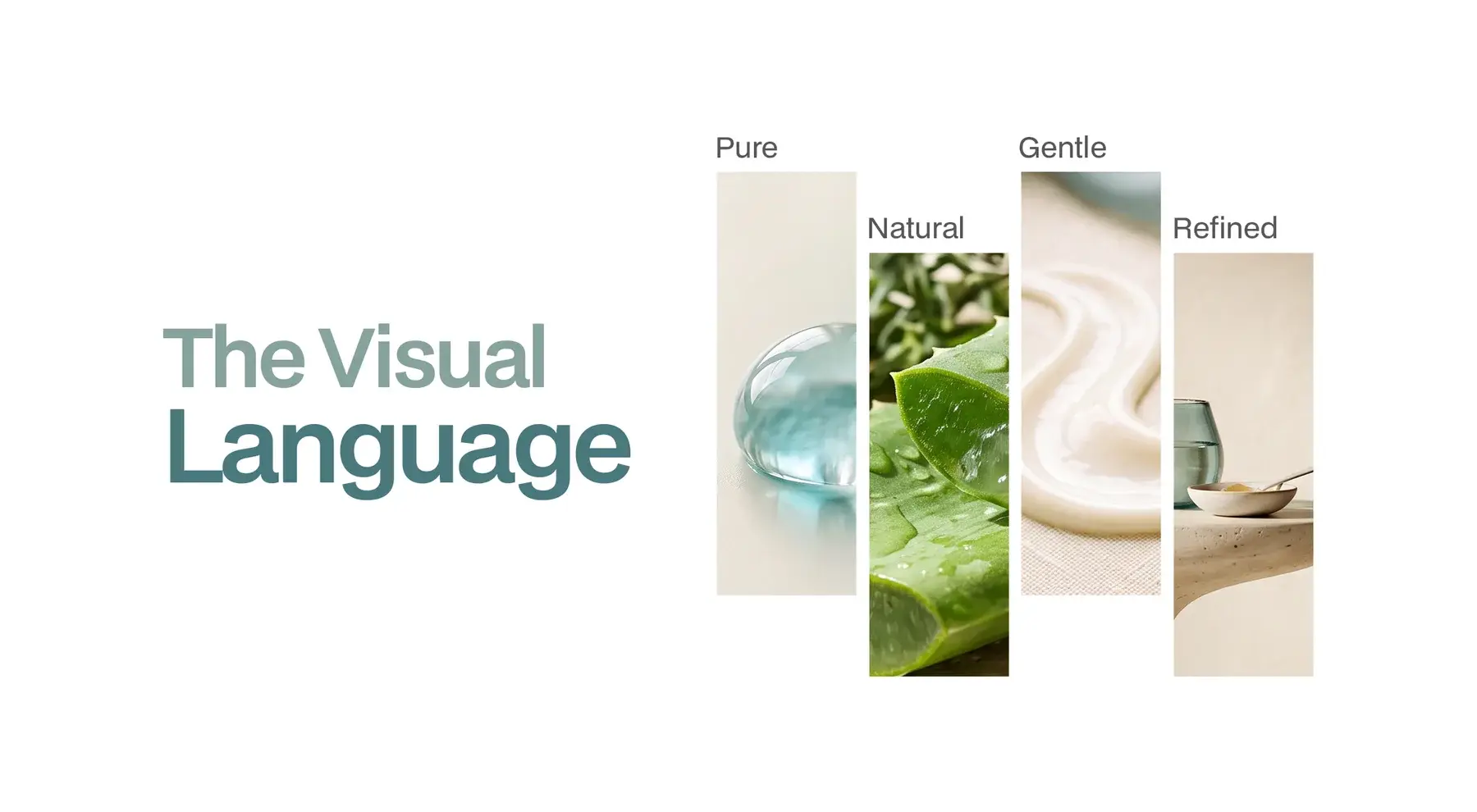
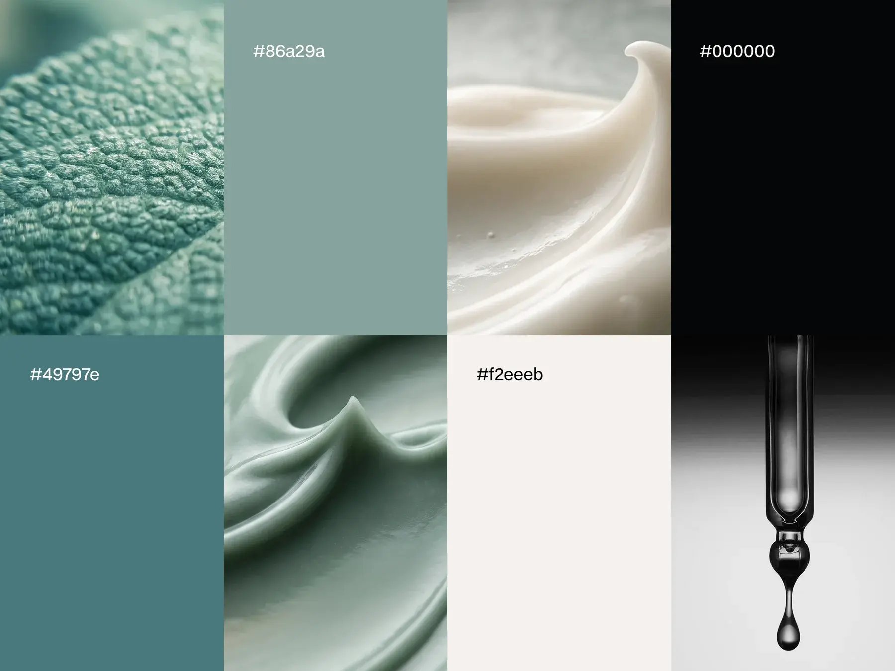
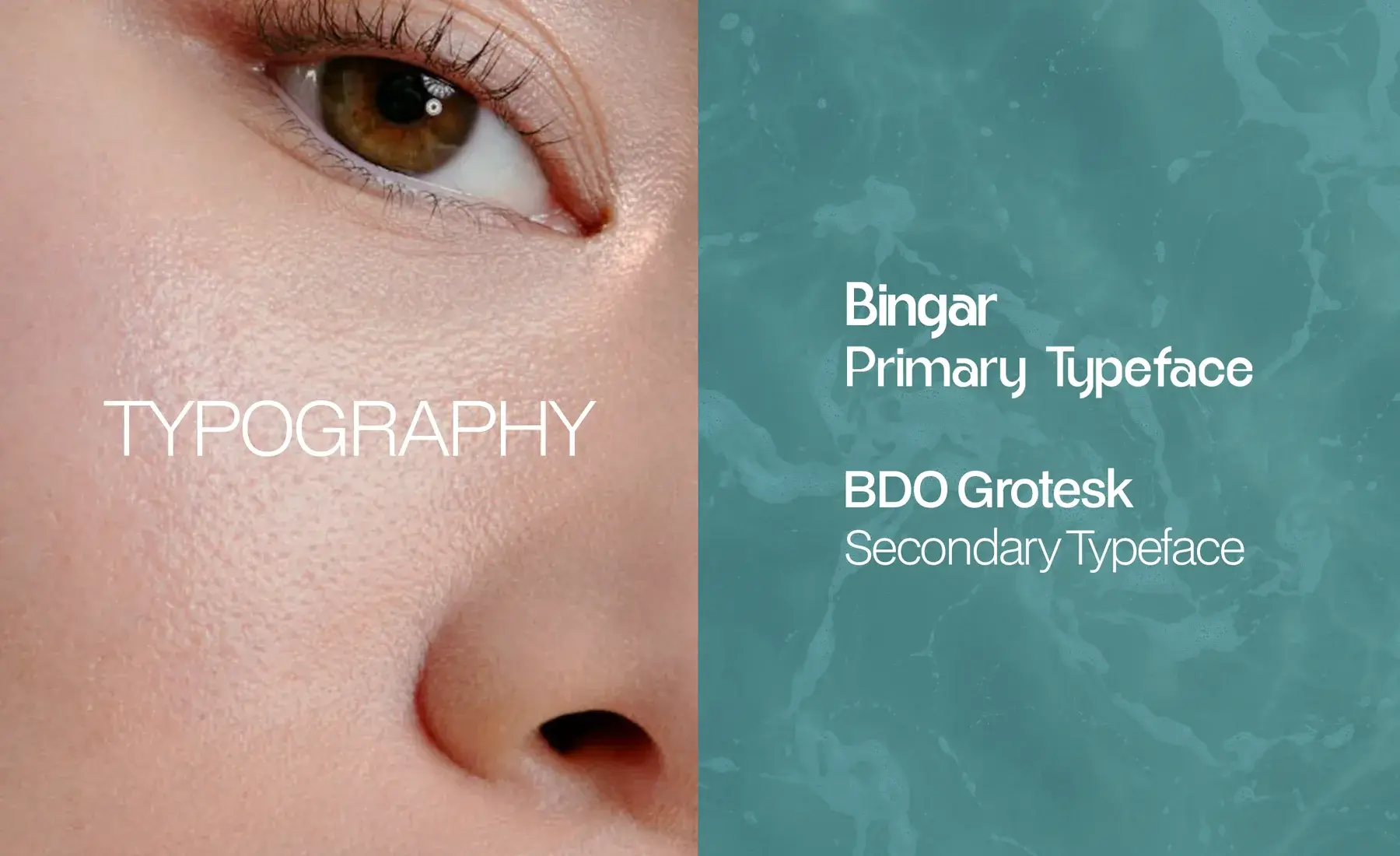
The visual language is pure, natural, gentle, and refined. Bingar is the primary typeface and BDO Grotesk the secondary, set against a palette of sage, deep teal, cream, and black.
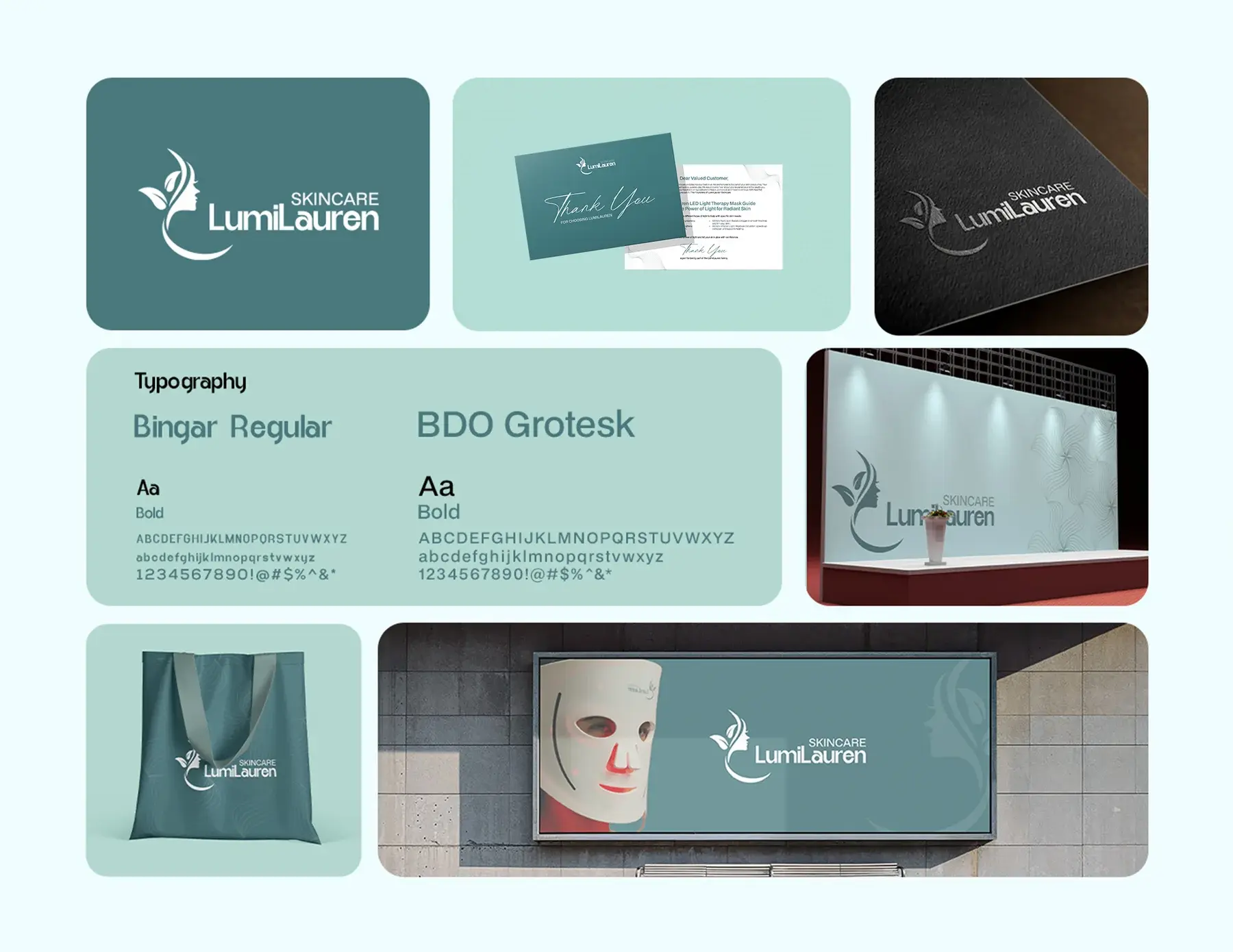
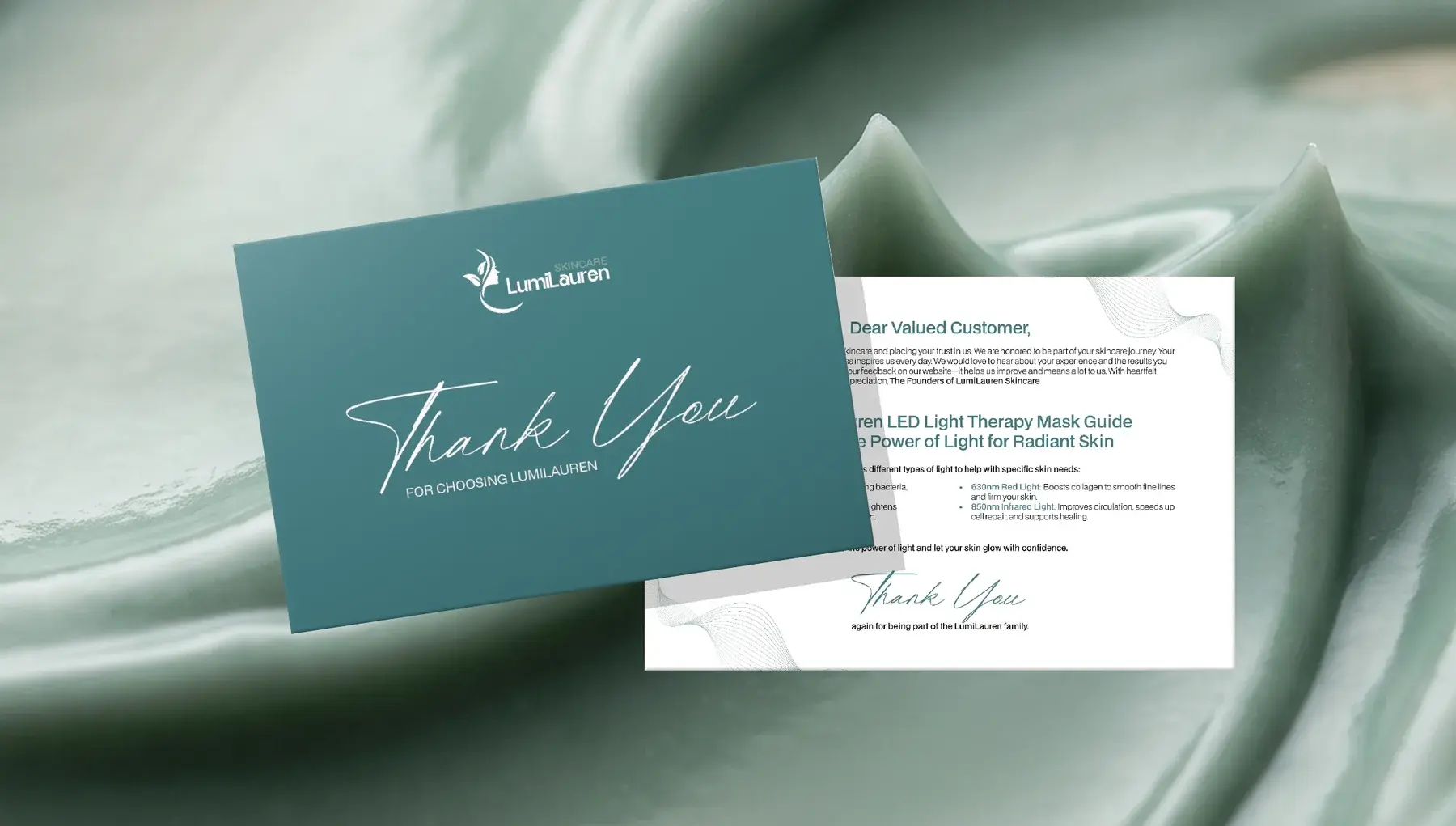
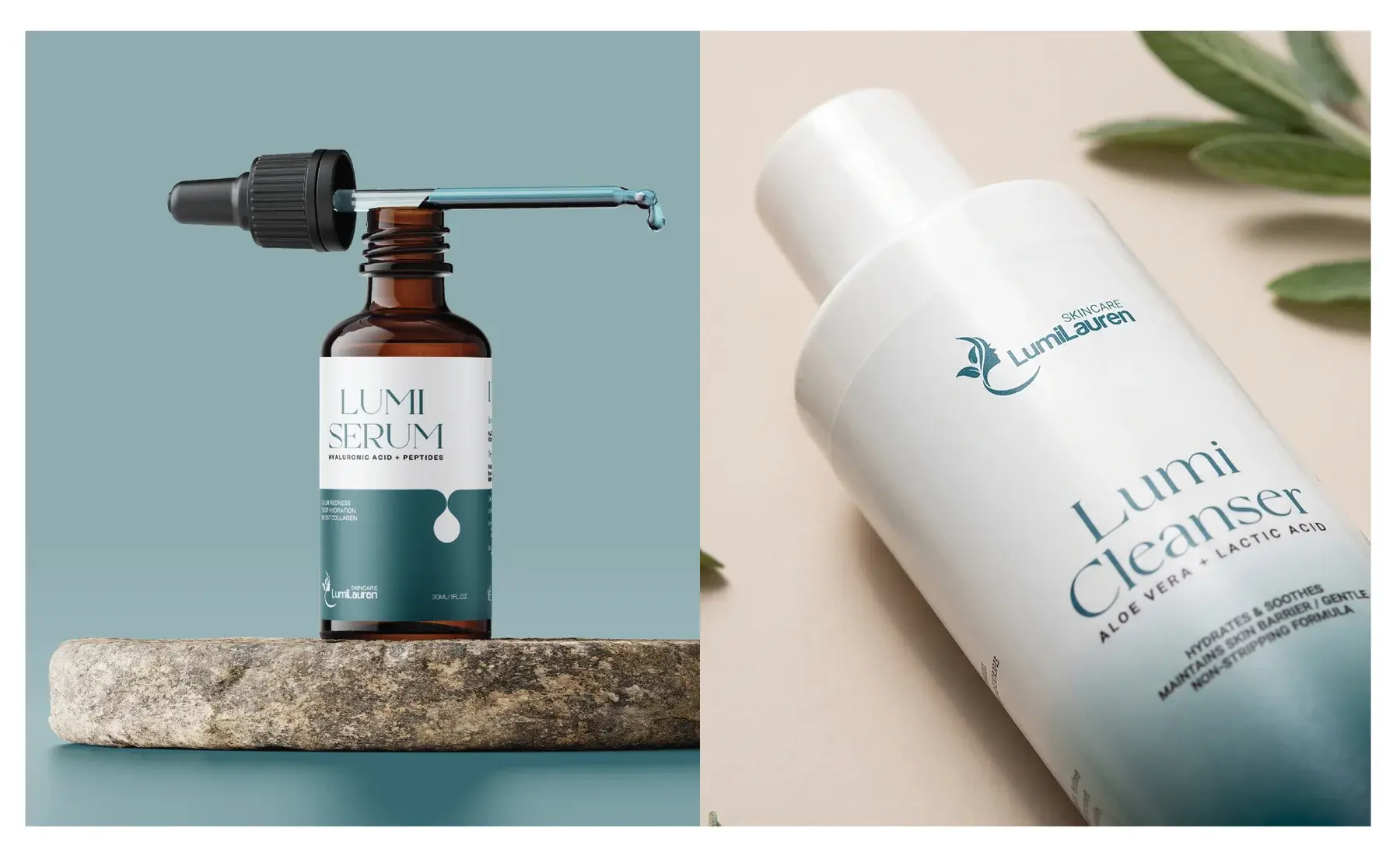
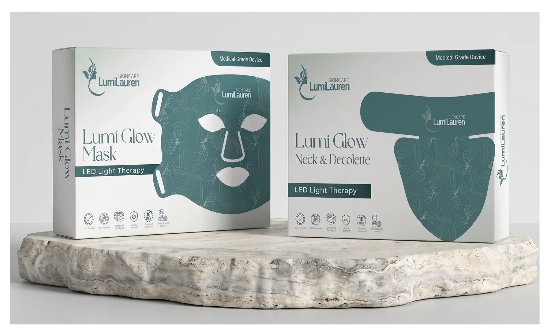
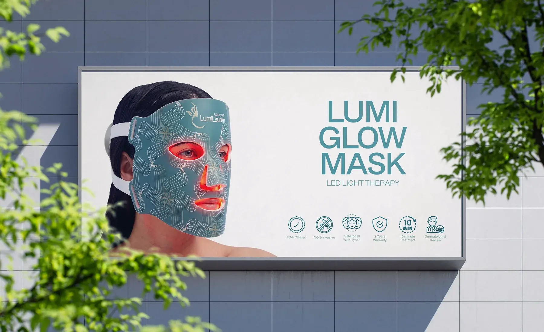
The visual identity moves beyond the logo to create a cohesive skincare product experience: the Lumi Serum and Lumi Cleanser, the Lumi Glow Mask and Lumi Glow Neck and Décolleté LED light therapy boxes, business cards, a thank-you card, a tote bag, and a billboard. A visual identity and product system created around purity, care, and timeless beauty.