
Brand Identity & Logo Design · Food & beverage
California Jerky Factory Brand Identity


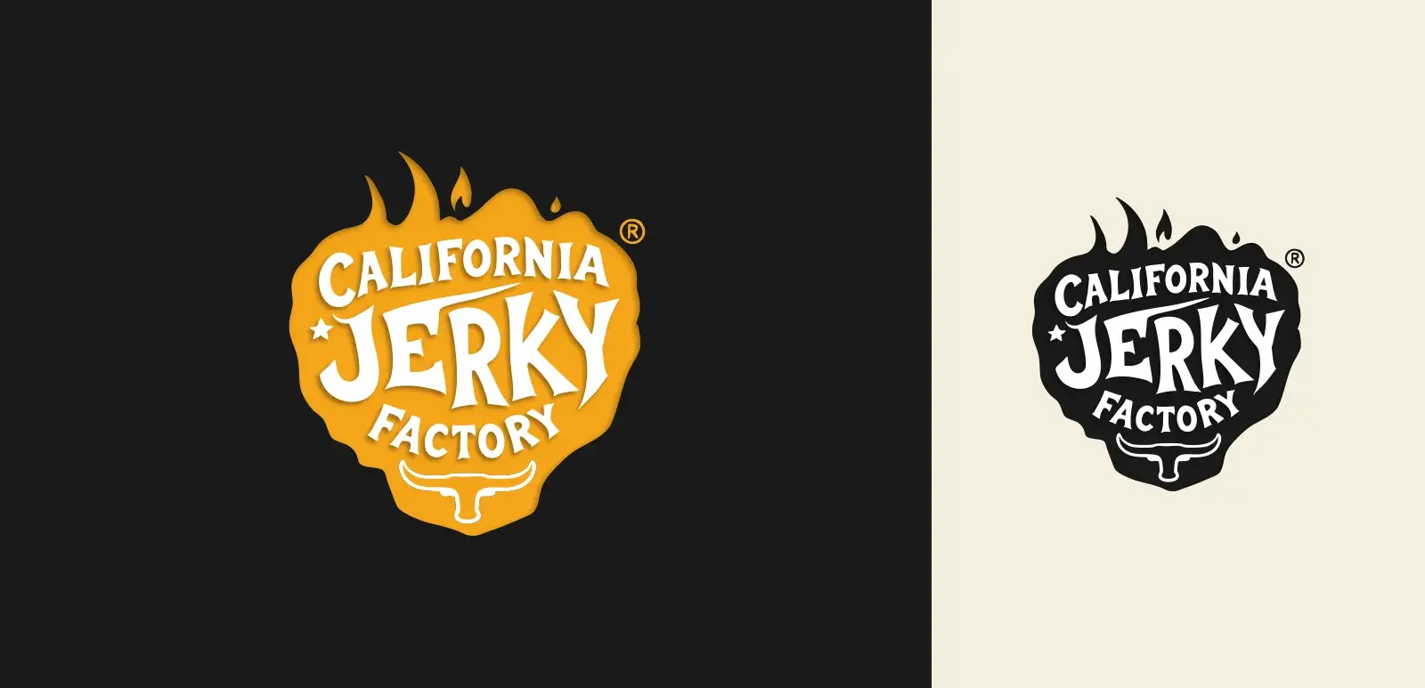
Brand identity and guidelines for California Jerky Factory: a flame badge logo with a bull horns mark, a Jerky Flame Orange and Charred Black palette, Merriweather and Genova typography, and a full guideline document with merchandise.
Commissioned client work · Designed by Gul E Lala Khan for California Jerky Factory in California, US
See what brand identity and logo design includes
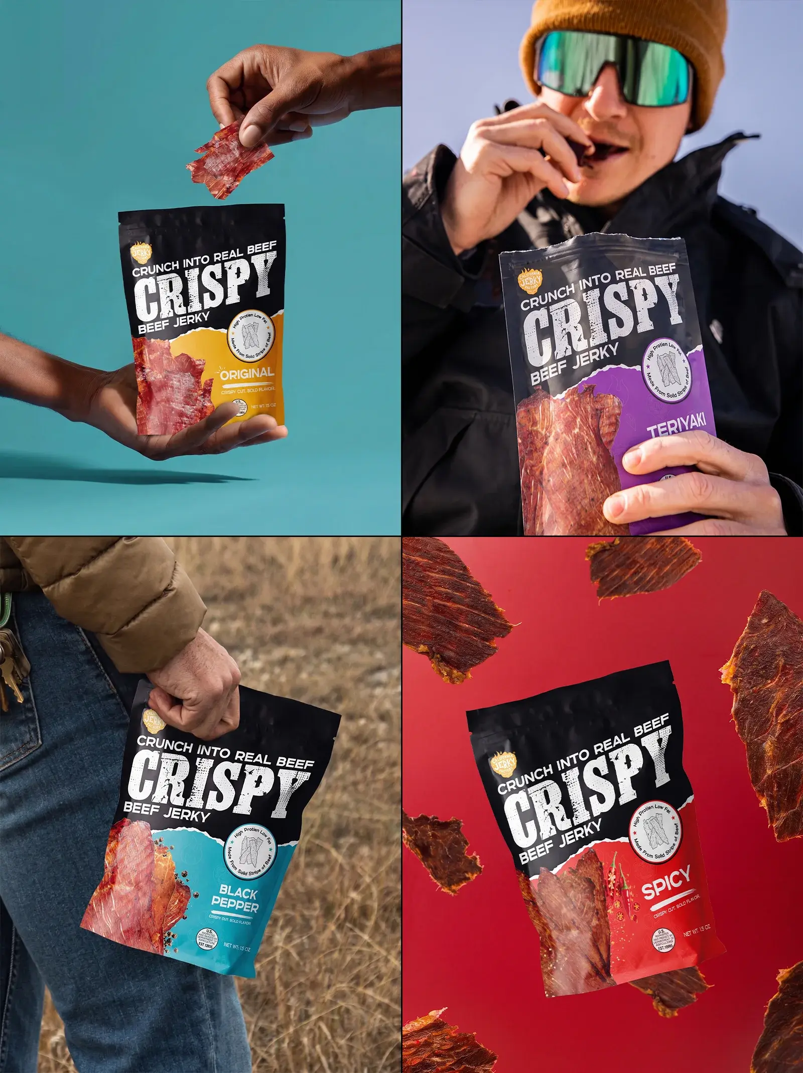
about this project
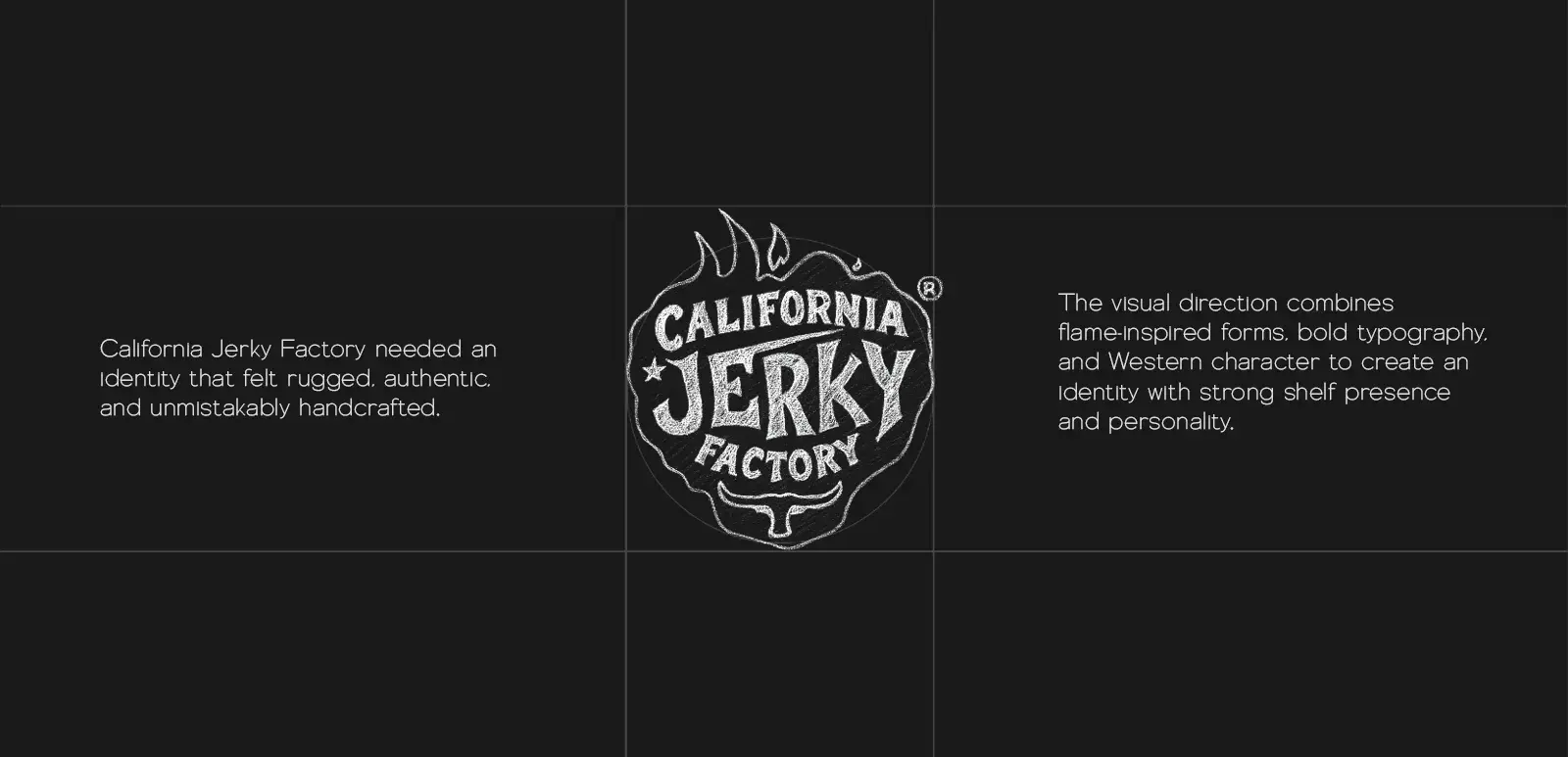
A bold identity crafted around fire, flavor, and the spirit of real beef jerky. California Jerky Factory needed an identity that felt rugged, authentic, and unmistakably handcrafted.
The visual direction combines flame-inspired forms, bold typography, and Western character to create an identity with strong shelf presence and personality.
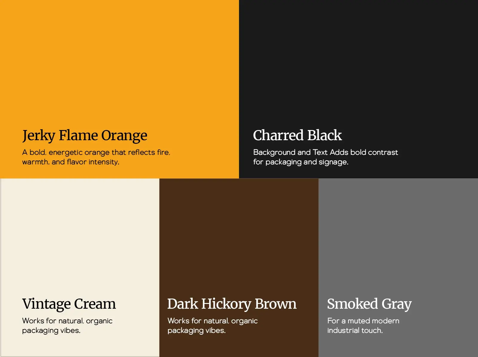
The palette is led by Jerky Flame Orange, a bold, energetic orange that reflects fire, warmth, and flavor intensity, and Charred Black for background and text, which adds bold contrast for packaging and signage. Vintage Cream and Dark Hickory Brown work for natural, organic packaging, and Smoked Gray adds a muted, modern industrial touch.
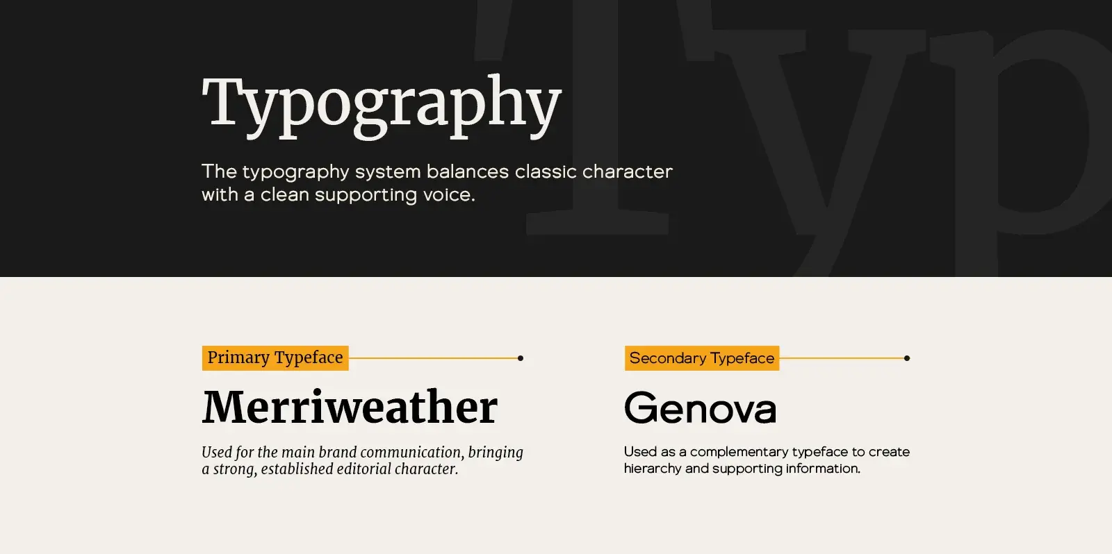
The typography system balances classic character with a clean supporting voice: Merriweather for the main brand communication, bringing a strong, established editorial character, and Genova as a complementary typeface for hierarchy and supporting information.
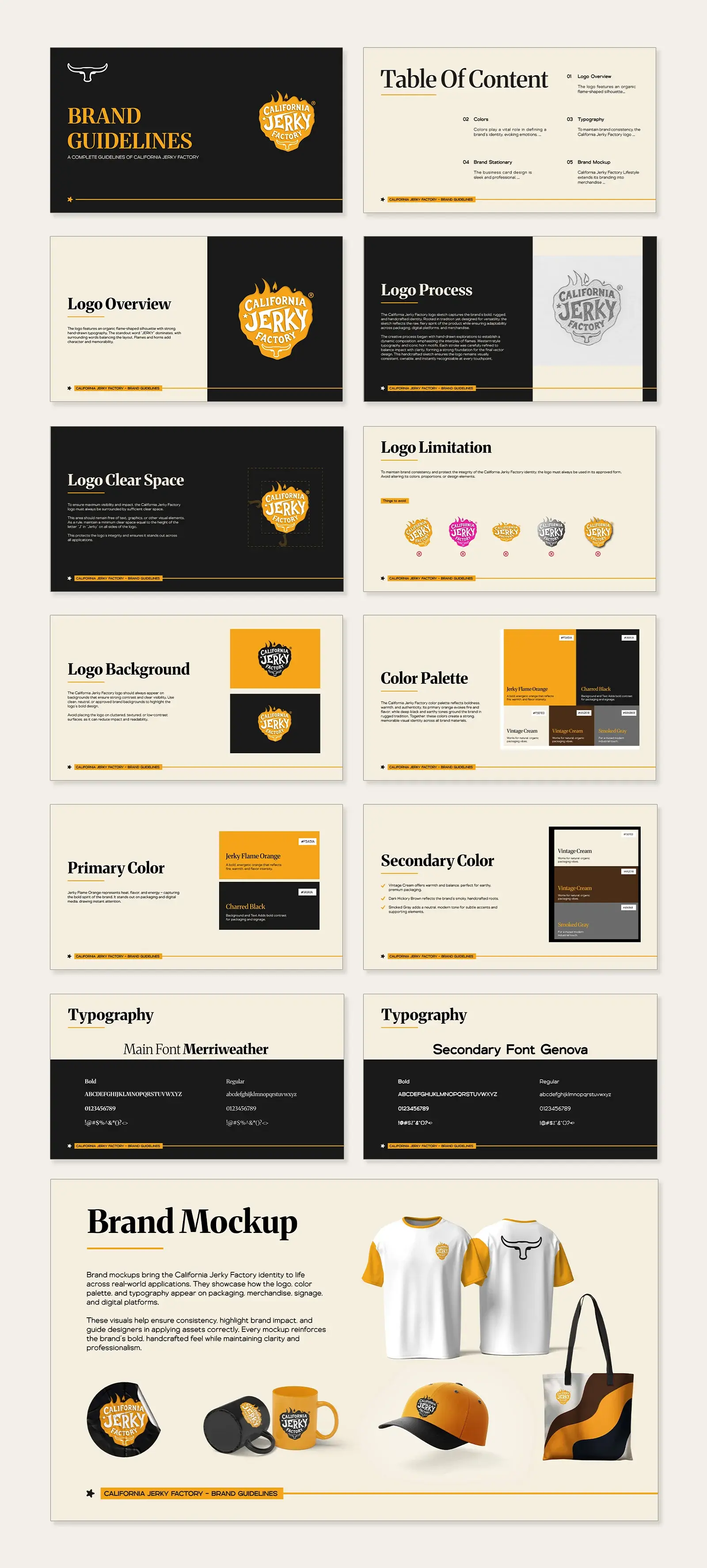
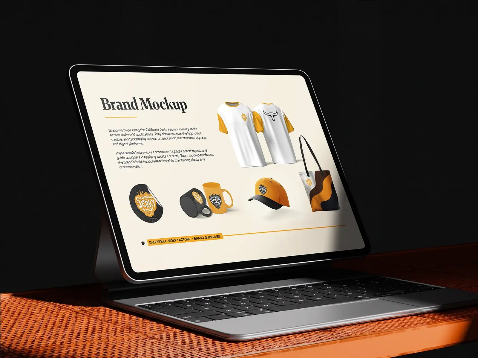
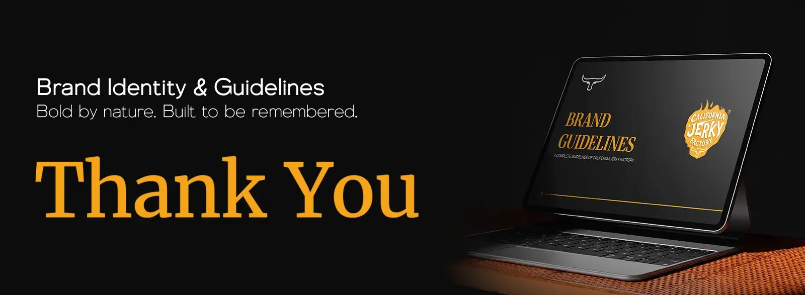
The guidelines cover the logo overview and process, clear space, limitations and backgrounds, the color palette, typography, and brand mockups on T-shirts, caps, mugs, and tote bags. Bold by nature. Built to be remembered.