UX/UI, Web & App Design
CESA Emergency Services Website Redesign


A UX/UI redesign for the Colorado Emergency Services Association, turning a complex support system for emergency service districts into a clear, trustworthy website with simple membership pathways.
See what UX/UI and web app design includes

about this project
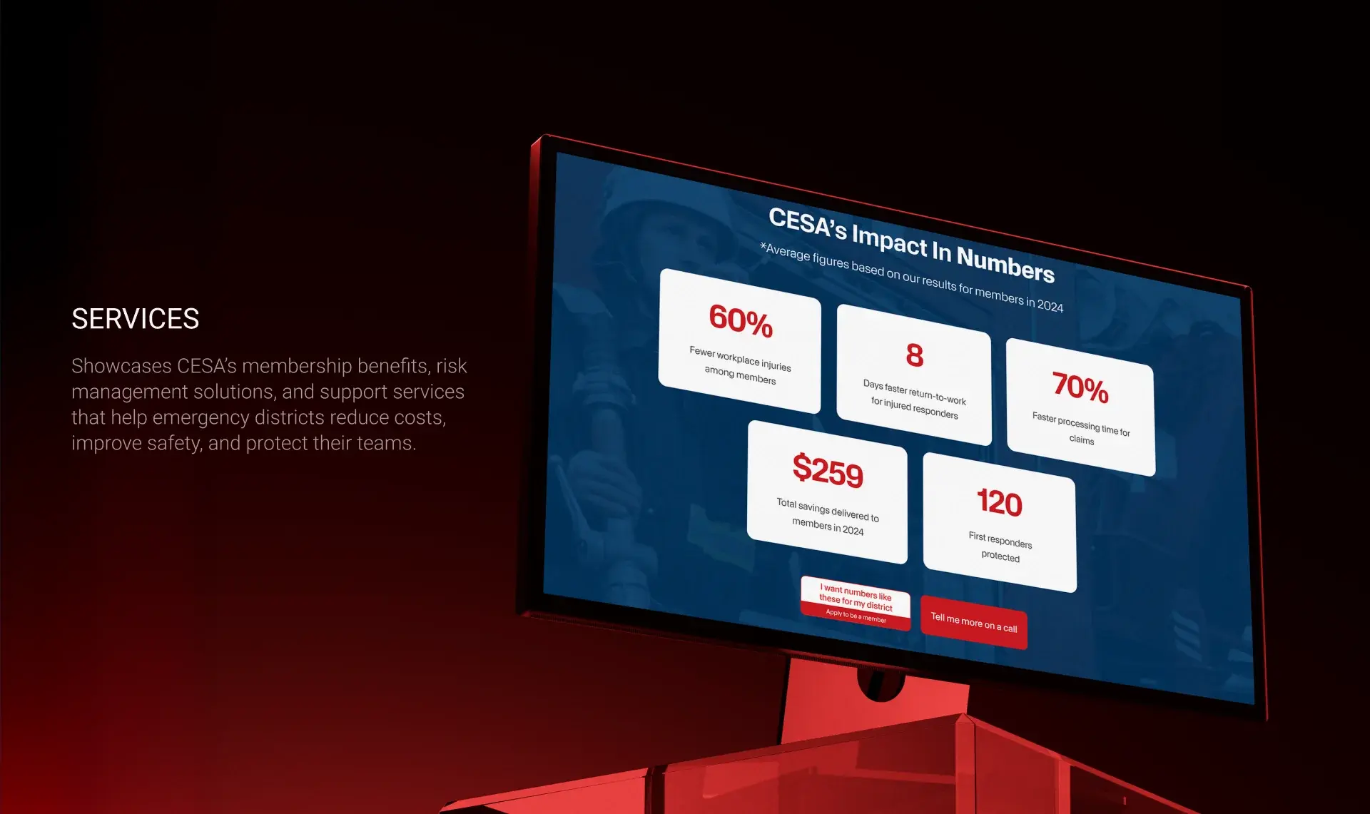
This UX/UI design project focused on transforming a complex emergency service support system into a clear, trustworthy, and easy-to-navigate digital experience. The design communicates CESA's value, simplifies membership pathways, and helps emergency service districts quickly understand key services like risk management, workers' compensation, claims support, and long-term safety planning.
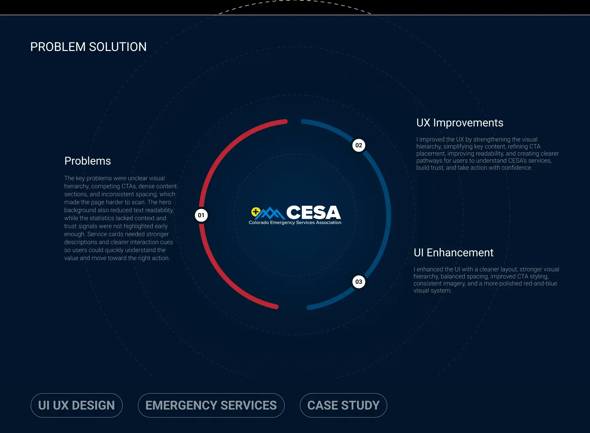
The key problems were unclear visual hierarchy, competing calls to action, dense content sections, and inconsistent spacing, which made the page harder to scan. The hero background reduced text readability, the statistics lacked context, and trust signals were not highlighted early enough.
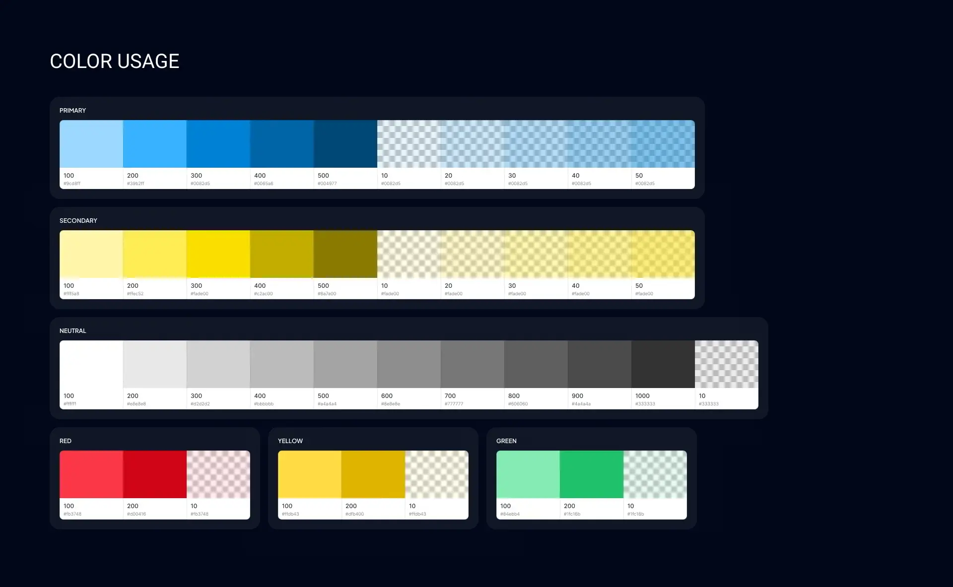
The UX was improved by strengthening the visual hierarchy, simplifying key content, refining CTA placement, improving readability, and creating clearer pathways for districts to understand CESA's services, build trust, and take action with confidence. The UI was enhanced with a cleaner layout, balanced spacing, improved CTA styling, consistent imagery, and a more polished red-and-blue visual system.
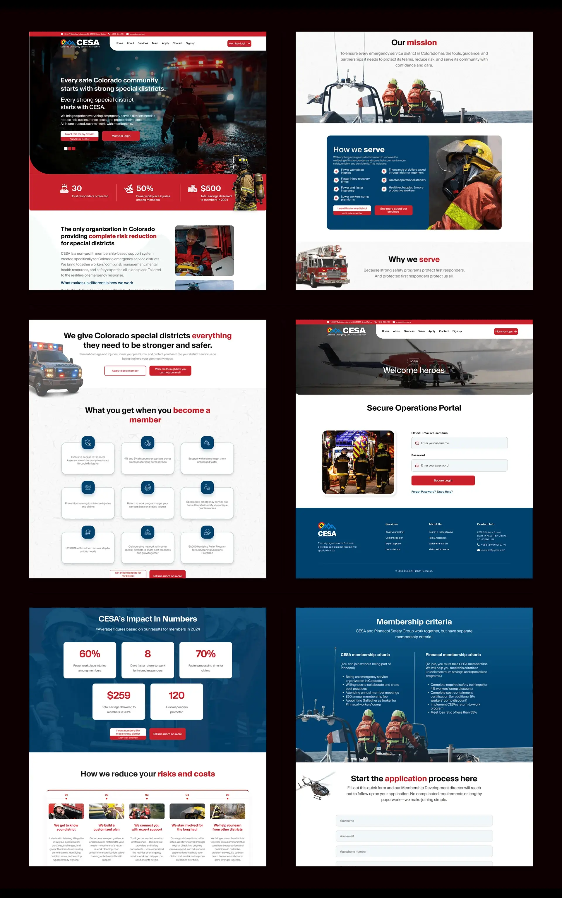
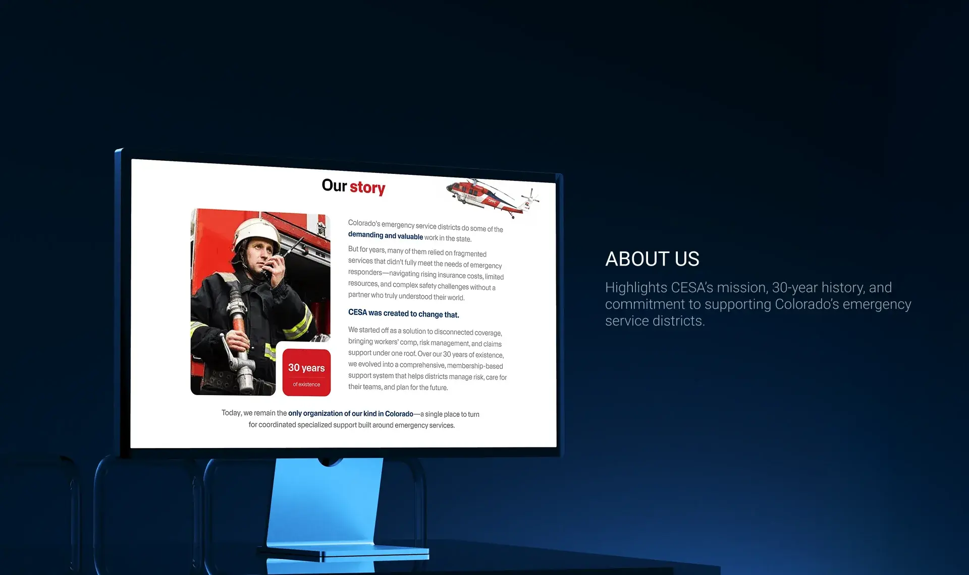
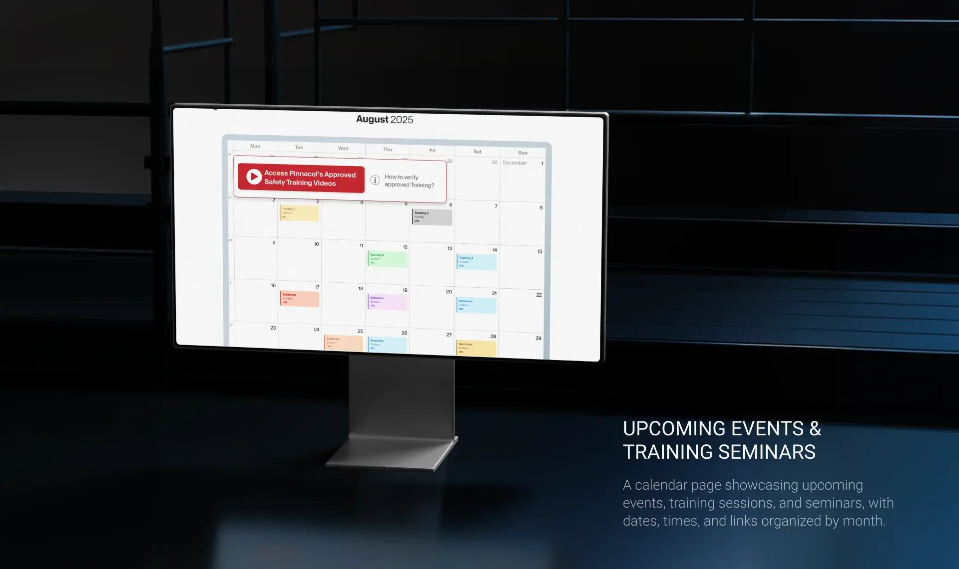
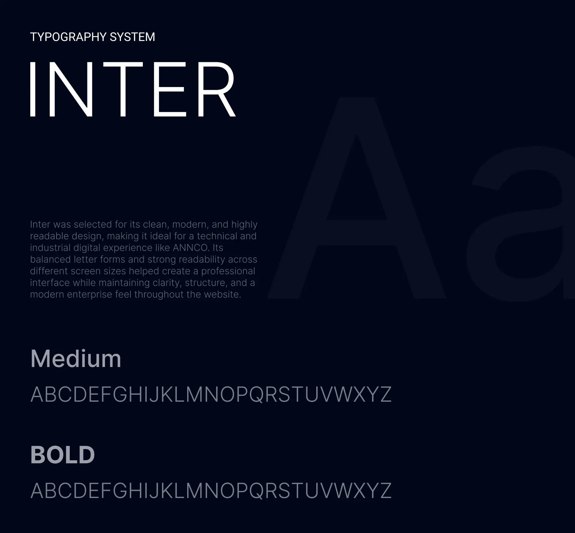
The redesign covers the full site: a homepage that leads with member impact numbers, mission and story sections, membership criteria and application, an events and training calendar, and a secure member operations portal, set in Inter on a 12-column grid.