Packaging & Product Design · Food & beverage
Krunchables Freeze-Dried Candy Packaging


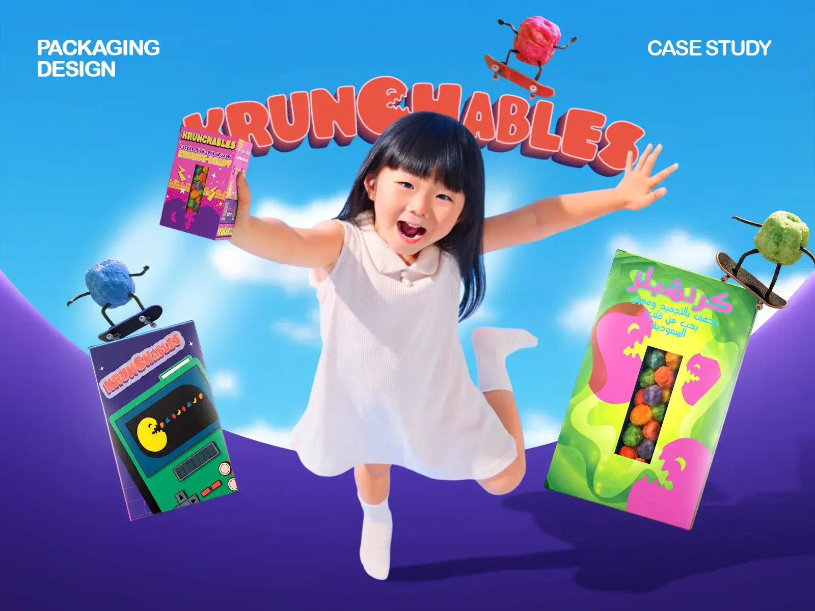
Playful bilingual packaging for Krunchables, a Saudi freeze-dried candy brand: three box directions with skateboarding candy mascots, English and Arabic faces, and interactive back panels, each as a full structural dieline.
Commissioned client work · Designed by Gul E Lala Khan for Krunchables, a freeze-dried candy brand in Jeddah, Saudi Arabia
about this project
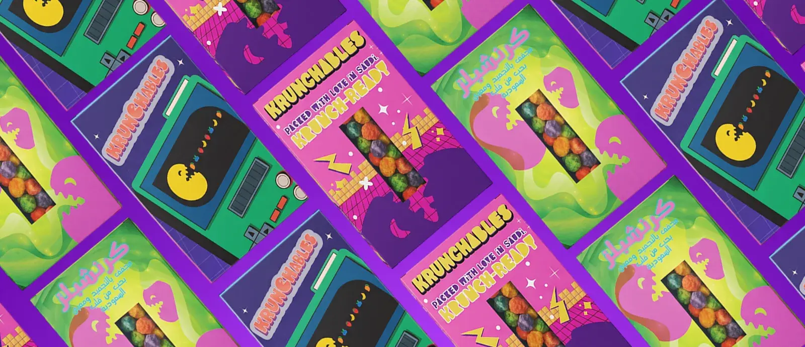
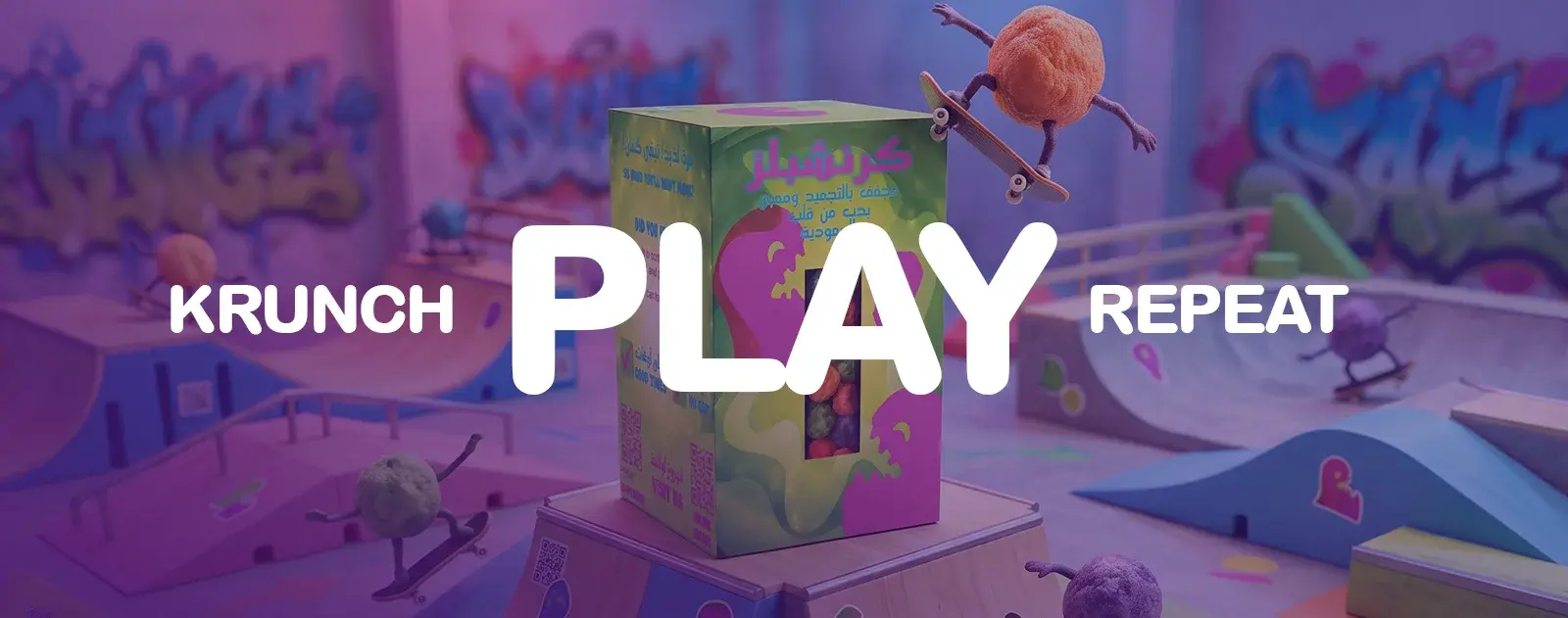
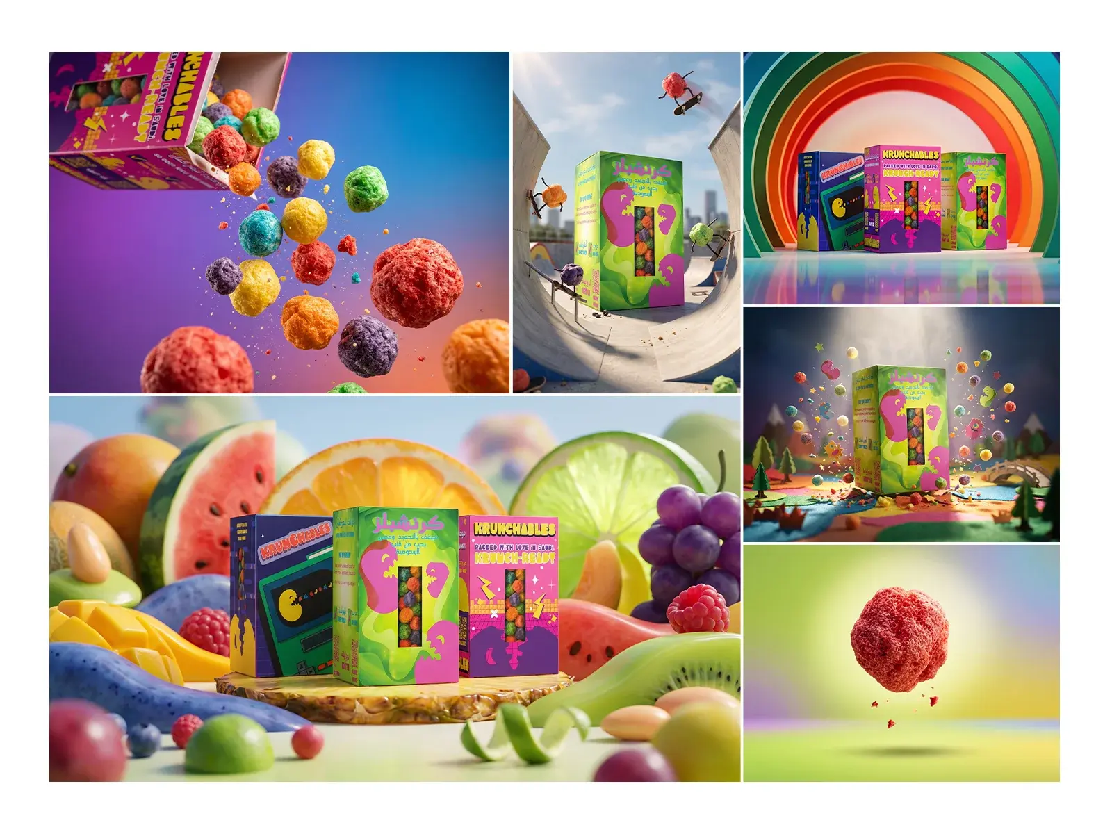
Krunchables is a freeze-dried candy brand packed in Saudi Arabia. The brief: a playful packaging system built around bold typography, energetic messaging, and a distinctive visual personality.
The packaging direction combines playful energy with clear visual communication: bold typography, playful messaging, strong visual contrast, interactive graphic elements, and English and Arabic integration. The goal: create packaging that feels fun, recognizable, and engaging from every angle.
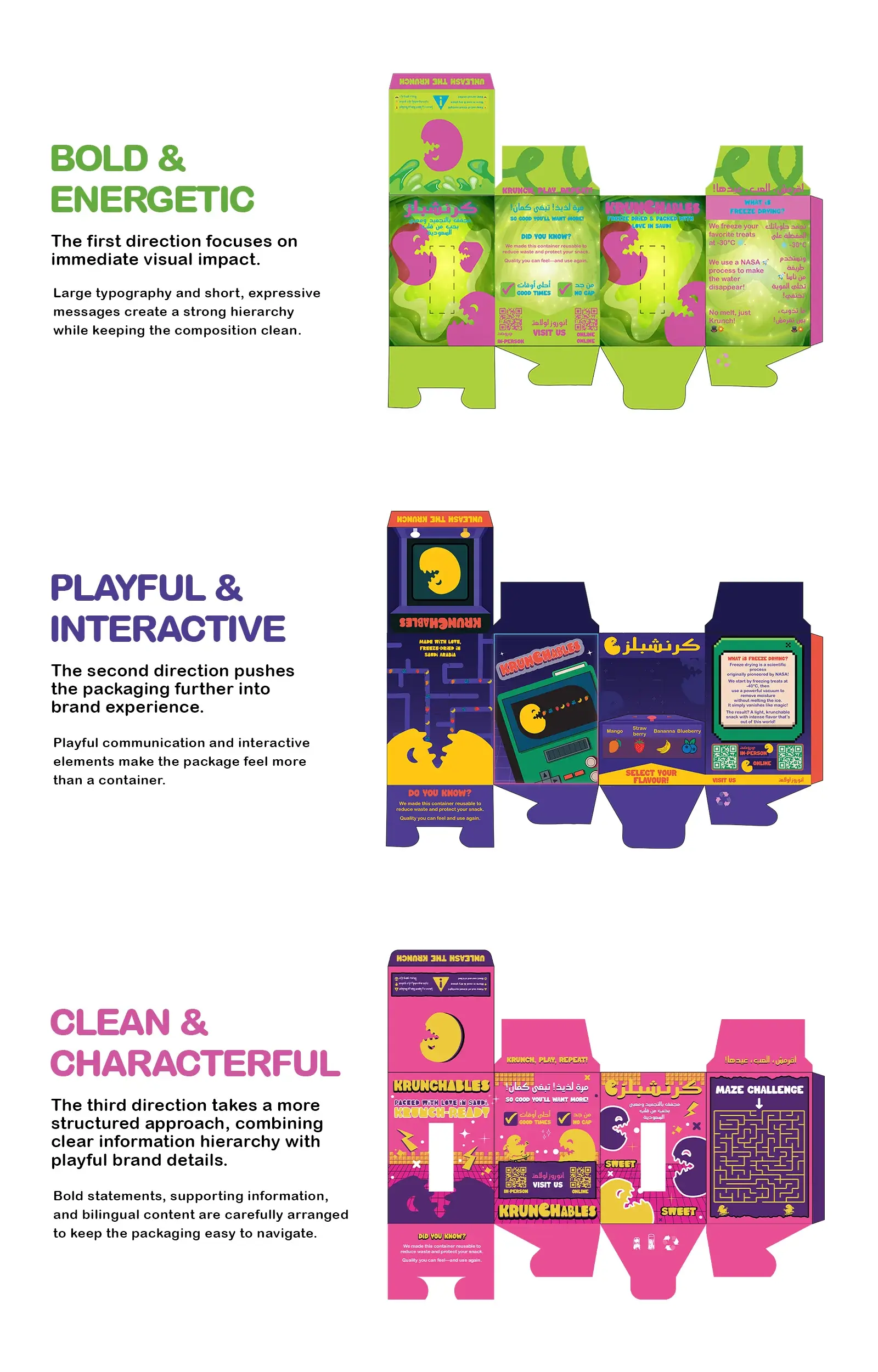
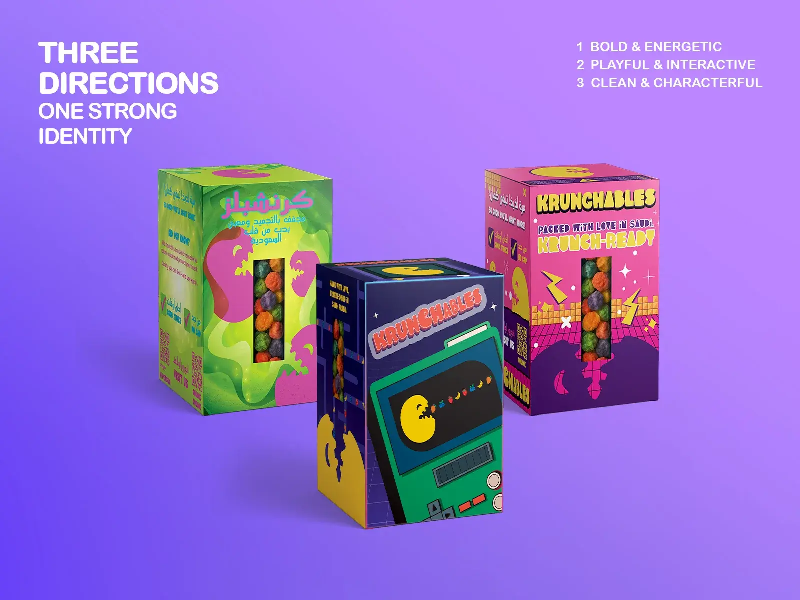
Three directions, one strong identity. Bold and Energetic leads with immediate visual impact, large typography and short, expressive messages. Playful and Interactive pushes the packaging further into brand experience. Clean and Characterful combines clear information hierarchy with playful brand details, with bilingual content arranged to keep the packaging easy to navigate.
Each direction ships as a full structural dieline with window cutouts, QR panels, a maze challenge, and freeze-drying explainers on the back.